# oh-knob-cell - Knob & Rounded Slider Cell
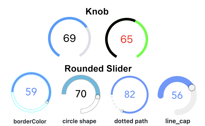
A cell expanding to a knob or rounded slider control
# Configuration
Use the advanced properties to change the appearance from a knob to a rounded slider.
# Cell
# header Header TEXT
Header of the cell
# title Title TEXT
Title of the cell
# subtitle Subtitle TEXT
Subtitle of the cell
# footer Footer TEXT
Footer of the cell
# icon Icon TEXT
Use oh:iconName (openHAB icon), f7:iconName (Framework7 icon), material:iconName (Material icon) or iconify:iconSet:iconName (Iconify icon, requires being online if not in cache)
# color Highlight Color TEXT
Color to use when highlighted
# on "On" expression TEXT
Expression to determine when the card should be highlighted. If blank, determine automatically from the primary bound item if applicable.
# Knob
# item Item TEXT item
Item to control
# min Min INTEGER
Minimum value (default 0)
# max Max INTEGER
Maximum value (default 100)
# step Step DECIMAL
Minimum interval between values (default 1)
# offset Offset DECIMAL
Offset to be applied to the Item's state (e.g. Item state = 2; offset = 20; knob/rounded slider behaves as Item state would be 22)
# ignoreDisplayState Ignore Display State BOOLEAN
Ignore the display state if available and always use the raw state.
# releaseOnly Send command only on release BOOLEAN
If enabled, no commands are sent during sliding
# commandInterval Command Interval INTEGER
Time to wait between subsequent commands in ms (default 200)
# delayStateDisplay Delay State Display INTEGER
Time to wait before switching from displaying user input to displaying Item state in ms (default 2000)
# disabled Disabled BOOLEAN
Disable the slider (usually set via an expression since the value will not be displayed when disabled)
# size Size INTEGER
Visual size of the control in px (or % if responsive is true)
# responsive Responsive BOOLEAN
Size the control using percentages instead of pixels
# strokeWidth Stroke Width INTEGER
Thickness of the arcs (default 18)
# startAngle Start Angle INTEGER
Angle of circle where the round slider should start (default -50); 0 is 9 o'clock; only if circleShape is not set
# endAngle End Angle INTEGER
Angle of circle where the round slider should start (default -130); 360 is 9 o'clock; only if circleShape is not set
# lineCap Line Cap TEXT
Sets the shape of the end of the path; dotted path and line cap cannot be used together.
Options:
# dottedPath Dotted Path TEXT
Length of dotted path segments (using css stroke-dasharray); dotted path and line cap cannot be used together.
# borderWidth Border Width INTEGER
Sets the border width of the slider (px value)
# handleSize Handle Size TEXT
Sets the size of the slider handle (px value)
# borderColor Border Color TEXT
Sets the border color of the slider; set borderWidth as well! (HTML value)
# pathColor Path Color TEXT
Sets the path color of the slider (HTML value)
# rangeColor Range Color TEXT
Sets the range color of the slider (HTML value)
# tooltipColor Tooltip Color TEXT
Sets the tooltip color of the slider (HTML value)
# Action
# actionUrl Action URL TEXT url
URL to navigate to or to send HTTP request to
# actionUrlSameWindow Open in same tab/window BOOLEAN
Open the URL in the same tab/window instead of a new one. This will exit the app.
# actionHttpBody HTTP Body TEXT
Body to send with the request
# actionItem Action Item TEXT item
Item to perform the action on
# actionCommand Action Command TEXT
Command to send to the Item. If "Toggle Item" is selected as the action, only send the command when the state is different
# actionCommandAlt Action Toggle Command TEXT
Command to send to the Item when "Toggle Item" is selected as the action, and the Item's state is equal to the command above
# actionOptions Command Options TEXT
Comma-separated list of options; if omitted, retrieve the command options from the Item dynamically. Use value=label format to provide a label different than the option.
# actionRule Scene, Script or Rule TEXT rule
Scene, Script or Rule to run
# actionRuleContext Context TEXT script
Object representing the optional context to pass. Edit in YAML or provide a JSON object, e.g. { "param1": "value1", "param2": { "subkey1": "testing", "subkey2": 123 } }.
# actionPage Page TEXT page
Page to navigate to
# actionModal Modal Page or Widget TEXT pagewidget
Page or widget to display in the modal
# actionModalConfig Modal component configuration TEXT props
Configuration (prop values) for the target modal page or widget
# actionPhotos Images to show TEXT
Array of URLs or objects representing the images. Auto-refresh is not supported.
Edit in YAML, e.g.- item: ImageItem1
caption: Camera[ "url1", { "item": "ImageItem1", "caption": "Camera" } ]
Objects are in the photos array format with an additional item property to specify an item to view.
# actionPhotoBrowserConfig Photo browser configuration TEXT
Configuration for the photo browser.
Edit in YAML or provide a JSON object, e.g.{ "exposition": false, "type": "popup", "theme": "dark" }
See photo browser parameters (not all are supported).
# actionGroupPopupItem Group Popup Item TEXT item
Group Item whose members to show in a popup
# actionAnalyzerItems Item(s) to Analyze* TEXT item
Start analyzing with the specified (set of) Item(s)
# actionAnalyzerChartType Chart Type TEXT
The initial analyzing period - dynamic or a predefined fixed period: day, week, month or year
Options:
# actionAnalyzerCoordSystem Initial Coordinate System TEXT
The initial coordinate system of the analyzer - time, aggregate or calendar (only time is supported for dynamic periods)
Options:
# actionAnalyzerAggregation Initial Aggregation TEXT
The initial aggregation of the analyzer -
Options:
# actionConfirmation Action Confirmation TEXT
Shows a dialog or sheet to ask for confirmation before the action is executed. Can either be a text to show in the dialog or a JSON object { type: "dialog", title: "Confirm", text: "Are you sure?" } or { type: "sheet", text: "Confirm", color: "green" }
# actionFeedback Action Feedback TEXT
Shows a toast popup when the action has been executed. Can either be a text to show or a JSON object including some of the supported parameters
# actionVariable Variable TEXT
The variable name to set
# actionVariableValue Variable Value TEXT
The value to set the variable to
# actionVariableKey Variable Key TEXT
Consider the variable value is an object and set the corresponding deep property within that object using a key syntax. Examples: user.name, user[0].address[1].street, [0], [0].label. The inner property and its parent hierarchy will be created if missing.
# Inherited Properties
Properties are forwarded to the underlying vue-round-slider (opens new window) component, which means you can set these parameters (opens new window). A compatibility layer ensures backward compatibility with the vue-knob-control (opens new window) component that was initially used.