# Building Pages: Components & Widgets
# UI Components: introduction and structure
UI components are the basic building blocks for many UIs in openHAB. The Main UI Pages and Personal Widgets are notable UI components, but Sitemaps that were created in the UI and HABPanel dashboards are as well.
These structures make up hierarchies that notably define the pages in their entirety, and are relatively simple. Each component has:
- A type
- Most of the time, a set of configuration properties
- Optionally, a set of named slots which hold collections of more components. By putting components into slots, we therefore define a hierarchy.
Slots are optional, and have a name; usually when there’re slots involved there’s a
defaultslot but not always.
The semantics of both the config properties and the slots depend on the component type, as well as the allowed sub-component types in the slots. The Component Reference provide details on what you can put in a certain component's config & slots.
Sometimes, the slots can be seen as different placeholders within a component where new components may be added. For instance, cell widgets have a header slot which represents the part of the cell when not expanded.
The default slot is the space in the cell which becomes visible when the cell is expanded.
In various parts of the UI page designers can "focus" on a particular component usually by selecting the Edit YAML item in a black context menu.
Below is a typical component as represented in YAML:
component: oh-type
config:
  prop1: value1
  prop2: value2
  prop3: =expression
  ...
slots:
  default:
    - component: ...
      config: ...
      slots: ...
    - component: ...
  anotherSlot:
    - component: ...
      ...
  ...
# Root Components & Props
At the top of the component tree we can find a root component. Pages are examples of root components. They have additional attributes:
uid: component1
props:
  parameterGroups:
    - name: group1
      label: Property group
    ...
  parameters:
   - name: prop1
     label: Prop 1
     type: BOOLEAN
     groupName: group1
     description: What prop1 does
   - name: prop2
     label: Prop 2
     type: TEXT
     context: item
     description: Choose an item for this prop
   - name: prop3
     type: INTEGER
     advanced: true
     ...
tags: ["tag1", "tag2"]
component: ...
config: ...
slots: ...
- a uid (its Unique IDentifier)
- a props structure describing its own properties; props define parameters and parameter groups following a subset of the configuration description schema found in bindings, services and throughout openHAB: see Configuration Descriptions
- a set of tags
# Widgets: Definition & Usage
Widgets are nothing more than discrete components that can be added to a Page.
No matter which type of page you’re editing, the designer will feature black buttons beside most widgets, that open a contextual menu for the widget in question.
These menus will in most cases allow you to:
- Configure the documented parameters with a config sheet (“Configure Widget” or similar)
- Open the part of the page’s YAML representation pertaining to the widget (“Edit YAML”), that is, a subgraph of the page’s component tree with that widget as its root component
- Perform cut/copy/paste operations, if supported (you can only do that in the same page currently, to copy or move widgets between pages, you may use the YAML view)
- Reorder the widget within its parent slot (these options are usually named “Move Up” and “Move Down” although you may occasionally encounter other labels, like “Move Left”/“Move Right”)
- Remove the widget
Configuring the widget with the config sheet is of course more user-friendly than editing the YAML, as the options are usually organized logically in groups and feature a description:
However, it's important to know that there are limitations and sometimes editing the YAML directly will be best, because:
Not all options are described, since widgets are often wrappers for a similar concept in the library it is based on, either Framework7, ECharts, Leaflet, or other specialized libraries. This means that in these cases, these underlying concepts will usually be passed the key/values of the (openHAB) widget component's config so that more parameters can be accepted than those which are documented in the widget's definition. Sometimes it will be indicated somewhere when configuring the widget, or in the openHAB documentation itself, on the other hand some options won't be available for use (for instance, because they expect a callback function and you cannot define those in the widget's config) or need some transformation.
Sometimes you'll want to use an expression to configure the property, but the UI will get in your way - for instance, it will display an item picker while your intention is to set the prop value to be
=props.item1. Learn more about widget expressions.To quickly and efficiently duplicate similar widgets with only a few differences, it is always way easier to copy/paste the relevant YAML in the editor.
The YAML is the best way of sharing complete or partial component structures like pages or widgets with others in the forum.
Besides, there are several options that virtually all widgets in layout pages, map pages and plan pages accept, all of which are not currently available in the config sheet:
visible: You can specify afalseboolean to this option to hide the widget. This powerful feature, combined with widget expressions, allows you to dynamically show widgets or even entire sections (if you use it on layout widgets containing other widgets), depending on the state of your items Example:visible: =items.TV_Powered.state === 'ON' && items.TV_Input.state === 'HDMI1'visibleTo: This accepts an array of strings likerole:administrator,role:user, oruser:<userid>, allowing the widget to be only visible to specific users or those with a certain role. Example:visibleTo: ["user:scott", "role:administrator"]classandstyleare standard Vue.js attributes (opens new window) and can be used to either alter the CSS classes or add inline styling to the component. Please refer to Styling pages & widgets using CSS.
# Types of Widgets
To help you define usable pages, there are a number of built-in widgets that you can use - most of which will be in layout pages. Those built-in widgets revolve around several libraries:
- The System library includes "crude" controls that you cannot add with the designers - for instance
oh-button,oh-slider,oh-colorpicker. Instead, you're more likely to use them within some container (card, list item...) provided by a widget of the Standard library; but when designing a personal widget with a complex layout you may want to use one or several of them directly. You may also use them in a slot of another widget, for those which define some, in order to add additional controls to that widget. - The Standard library, which has several classes of widgets:
- layout widgets, examples:
oh-block,oh-masonry,oh-grid-row,oh-grid-colthat you usually add with the designer to a layout page - standalone widgets, examples:
oh-label-card,oh-slider-card,oh-player-card- usually not much more than widgets from the System library wrapped in a card - list item widgets, examples:
oh-list-item,oh-stepper-item,oh-toggle-item- widgets that are thinner than the standalone ones, which you can only add as a part of a list (oh-listoroh-list-card) - cell widgets, examples:
oh-cell,oh-knob-cell,oh-colorpicker-cell: These widgets are fixed-size cells that you can only add to anoh-cellscontainer widget immediately below anoh-blockin a layout page - they will either perform an action - switching a light on & off - or expanding to reveal additional controls - page-specific widgets, for instance map pages have
oh-map-markeroroh-map-circle-marker, charts have different types of widgets than the rest to represent axes, series etc.
- layout widgets, examples:
See the Component Reference for details about the different libraries of components.
# Dynamically Configuring Components with Expressions
To dynamically configure components based on data changed on runtime, expressions can be used.
Please refer to widget expressions for more information.
# Modifying Styling with CSS
In case you want to customize the styling of a page or all its widgets, you can set CSS classes and properties globally for the page:
config:
  label: My Page
  style:
    --f7-card-border-radius: var(--f7-card-expandable-border-radius)
Please read CSS for Pages & Widgets to learn more about using CSS.
# Actions
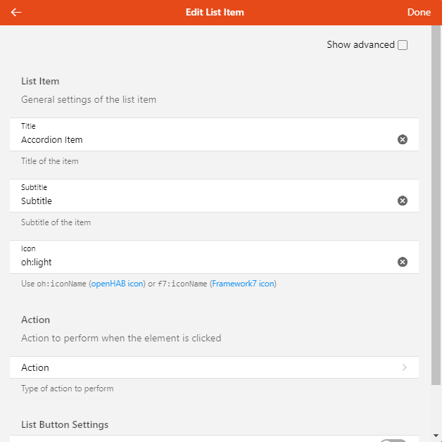
When configuring a widget, you will encounter options related to actions (usually, when something is clicked or touched, but there might be several actions configured for a single widget, for instance, clicking on different parts or a long tap with a touch device); regardless, they will all have the same options:
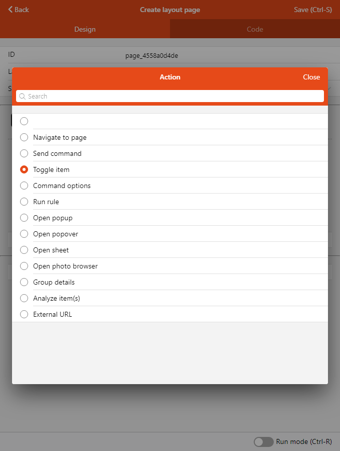
These action options allow you to configure the interactivity within your pages, as well as the relation between them, in an extensive way. You can navigate to another page, display additional controls, popups and other modals, send commands to items every time a widget allows you to choose an action. For instance, a floor plan marker might either open another page in a popup, or toggle an item. Configuring the action type reveal more options in the action sheet:

# Types of Actions
| Action | What it does |
|---|---|
| Navigate to page | Opens a different Page with an optional transition. |
| Send command | Issues a command to an Item. |
| Toggle Item | Alternate an item between two states by sending commands (regular command if the item's state is different, or an alternative command if the state is equal to the regular command). Typically used with ON/OFF. |
| Command options | Issues a command to the configured Item based on a comma-separated locally-defined list of options, or on the Item's State Description. |
| Run rule | Trigger a rule directly. |
| Open popup | Open a Page or personal widget in a popup which will be displayed fullscreen on phones and in a 630x630-pixel modal dialog on larger screens. |
| Open popover | Open a Page or personal widget in a small "callout" comic-like bubble |
| Open sheet | Open a Page or personal widget in a drawer appearing from the bottom of the screen. |
| Open photo browser | Displays a full screen interface to view one of several images |
| Group details | Used with Group items to open a popup with an automatically-generated list of the members of the group, represented by their default list item widget. For Groups with a base type like Switch, a standard card widget will also be shown for the Group itself. |
| Analyze Item(s) | Opens the Analyzer window for the specified item(s) and period |
| External URL | Open an external web page |
| Set Variable | Set a variable that you can use in other parts of the page or widget. |
TIP
In your own personal widgets (see below code snippet), you can define a parameter group with an action context to automatically define implicit props that you can pass "en masse" to built-in components that accept actions with the actionPropsParameterGroup property:
props:
  parameterGroups:
    - name: myaction
      label: My Action
      context: action
...
  component: oh-button
  config:
    actionPropsParameterGroup: myaction
How the implicit props are named
The property names will be in the following format: {groupName}_{actionPropName}
The list of actionPropNames can be found in the Component Reference (they’re always the same), for instance in the oh-button reference.
⚠️ The groupName prefix is the name of the parameter group, but occurrences of the word "action" will be removed from it.
If you name the parameter group action there won't be a prefix anymore so the underscore will be removed too.
Examples:
| Group Name | Prop Name Examples |
|---|---|
| action | action, actionItem, actionCommand, actionCommandAlt |
| tapAction | tap_action, tap_actionItem, tap_actionCommand, tap_actionCommandAlt |
| sceneOne | sceneOne_action, sceneOne_actionItem, sceneOne_actionCommand, sceneOne_actionCommandAlt |
You can dump the props objects in JSON to verify the names like in the following example (or just use =JSON.stringify(props) wherever you can display text in your widget):
uid: dump_props_as_json
props:
  parameterGroups:
    - name: sceneOne
      context: action
      label: Scene One
    - name: sceneTwo
      context: action
      label: Scene Two
    - name: tapAction
      context: action
      label: Tap Action
    - name: action
      context: action
      label: Tap Action
  parameters:
    - name: prop1
      label: Prop 1
      type: TEXT
      description: A text prop
tags: []
component: f7-row
config:
  tag: pre
slots:
  default:
    - component: Label
      config:
        text: =JSON.stringify(props, null, 4)